How to Read Preflop Range Charts for 6-Max NLHE
Preflop range charts are the foundation of modern poker study. Whether you are building a solid opening strategy or learning how to respond to a raise, the 13x13 grid is the standard way to visualize which hands to play and how. If you have ever stared at one of these charts and felt lost, this guide breaks down every element so you can read them fluently.
What Is a Preflop Range Chart?
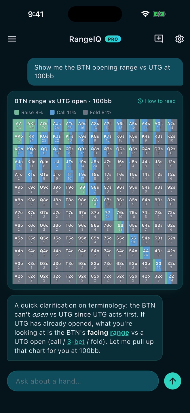
A preflop range chart shows every possible starting hand in No Limit Holdem and tells you what to do with each one in a specific situation. The chart is a 13x13 grid: 169 cells covering all 13 ranks (Ace through 2) crossed with themselves. Each cell represents one hand class, and the color tells you the recommended action: raise, call, or fold.
The chart is not a guess. In a GTO-context tool like RangeIQ, every cell is backed by a real solver run using Counterfactual Regret Minimization (CFR+). The numbers come from equilibrium math, not someone's opinion.
The 13x13 Grid Layout
The grid is organized in a specific way that becomes second nature once you know the rules:
- Diagonal (top-left to bottom-right): Pocket pairs. AA is in the top-left corner, KK next to it, all the way down to 22 in the bottom-right.
- Upper triangle (above the diagonal): Suited hands. These are stronger than their offsuit counterparts. AKs sits above the diagonal, AQs next to it, and so on.
- Lower triangle (below the diagonal): Offsuit hands. AKo is below the diagonal. These are weaker because they make fewer flushes and straights.
The ranks run A, K, Q, J, T, 9, 8, 7, 6, 5, 4, 3, 2 from top to bottom on the left side and left to right across the top. Find the row for your first card and the column for your second card (or vice versa) and the cell where they meet tells you the hand.
Color Coding: What Each Band Means
Range charts use color to communicate the action at a glance. RangeIQ uses three colors:
- Green (Raise): The solver wants you to raise (or open-raise). At push/fold stack depths (25bb and below), this band reads "Jam" instead.
- Amber (Call): The solver calls. This shows up in facing spots, like responding to an open, where calling is part of your strategy.
- Grey (Fold): The solver folds. Most of the grid in tight spots will be grey.
The header of each chart names the exact spot and stack depth. For example, "BTN opening range - 100bb" tells you this is the button's open-raise range at 100 big blinds. "BTN range vs CO open - 100bb" tells you this is how the button responds to a cutoff open. Always check the header so you know what situation the chart describes.
Split Cells: When a Hand Is Played Two Ways
Not every cell is a single color. Some cells are split, showing two colors with a percentage. A split cell means the solver mixes between actions at that frequency. For example, if A5s shows the number 60 in a raise/call split, it means you raise 60% of the time and call 40% of the time with that hand.
Split cells often appear in close spots. Hands on the border between raise and call, or between call and fold, tend to be mixed. The percentage tells you how often to take each action. You do not need to follow the mix exactly to play well, but understanding that the hand is borderline helps you see the strategy more clearly.
The Legend: Combo-Weighted Range Share
Below the grid, the legend summarizes the entire range by action. It shows the combo-weighted share for each action: Raise (or Jam) percent, Call percent (in facing spots), and Fold percent. This gives you a quick read on how wide or tight the range is overall. A BTN opening range at 100bb might show 45% Raise and 55% Fold, while a 15bb push/fold chart on the button might show a much wider Jam percent.
Stack Depth Changes Everything
The same spot can look very different at different stack depths. At 100bb, the button opens a wide range. At 15bb, the button is in push/fold mode, and the grid shows only Jam and Fold (no Call). At 200bb, deeper stacks mean more implied odds, so the Call band widens compared to 100bb.
RangeIQ serves ranges at eight stack depths: 10bb, 15bb, 20bb, and 25bb (push/fold, where the only open is a jam and facing it is call or fold), plus 100bb, 150bb, 200bb, and 250bb (full depth). If you ask for a range without naming a depth, the app shows a depth picker so you can choose. Always know your effective stack before studying a chart.
How to Use Range Charts in Your Study
Reading the chart is step one. Here is how to turn that reading into improvement:
- Pick one spot at a time. Start with a common situation like "BTN opening range at 100bb." Learn which hands you raise, which you fold, and where the split cells are.
- Compare to your instincts. Before you look at the chart, write down what you think the range should be. Then compare. The gaps between your guess and the solver are your study targets.
- Drill the spot. RangeIQ lets you drill a specific spot, answering hand after hand with instant solver-grounded feedback. A drill is a stratified deck of 10 hands that spreads across GTO actions and prefers the hands you keep missing.
- Check the cost of mistakes. When you get a hand wrong, the cost of mistake card shows the exact EV loss in big blinds. Some deviations cost fractions of a bb; others cost several. Prioritize the expensive ones.
- Repeat until the range is internalized. The goal is not to memorize the chart pixel by pixel. It is to build an intuitive feel for what the solver does and why, so you can play confidently without checking.
Common Mistakes When Reading Range Charts
Here are a few pitfalls to avoid:
- Treating mixed frequencies as exact rules. If a hand is played 70/30, you do not need to raise exactly 70% of the time. The mix exists because the solver is balanced. In practice, lean toward the higher-frequency action unless you have a specific read.
- Ignoring stack depth. A 100bb chart does not apply at 20bb. Always confirm the depth in the chart header before using it.
- Confusing suited and offsuit. Suited hands (above the diagonal) are significantly stronger. A5s might be a raise while A5o is a fold. The grid layout makes this easy to spot once you know where the diagonal is.
- Forgetting the chart is a baseline, not a mandate. GTO ranges are the equilibrium. Against real opponents who deviate, you can and should adjust. RangeIQ's exploit advice feature gives you a grounded baseline plus a curated adjustment for common villain tendencies.
Putting It Together
Preflop range charts compress a lot of solver output into a compact visual format. Once you understand the grid layout, the color coding, and the split cells, you can absorb a range in seconds. The 13x13 grid is the fastest way to see what the solver does in any spot, and it is the same format RangeIQ uses to render ranges inside the chat coach.
Start with one spot, drill it until the range feels natural, then move to the next. Over time, your preflop decisions become faster, more confident, and more accurate. That is the whole point of studying with solver-backed ranges: you build intuition that holds up at the table.
Want to study ranges interactively? Read our complete guide to 6-max preflop ranges, or explore more RangeIQ blog posts for strategy tips and feature deep dives.
Study preflop ranges with a real solver
RangeIQ renders exact GTO ranges on the 13x13 grid, then drills the hands you get wrong with instant feedback. Free to start.
Download RangeIQ